Type:Rider review
Font of all knowledge.

It always smacks of laziness to introduce a game by declaring it a meeting between two well-known titles, but when the result is "Limbo meets Trials" and its aim is to educate the player in the history of typography, it's hard not to bask in the sheer left-field genius of the combination.
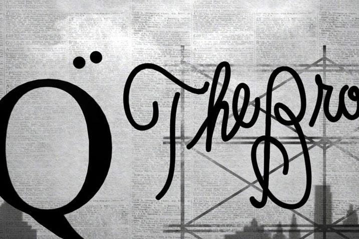
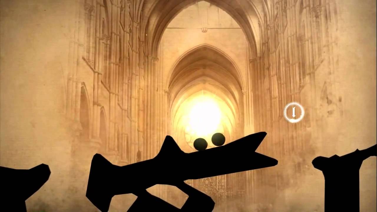
So, Type:Rider borrows the stylish silhouette aesthetic of Limbo but pairs it with the physics-battling traversal challenges of Trials. Rather than a motorbike, you're controlling a colon, turned on its side, and instead of barrels and ramps you're carefully navigating the curls and serifs of real-world typefaces on an interactive journey that begins with cave paintings and hieroglyphics and takes you all the way to the dawn of the digital age, via the Gutenberg press, Letraset and movable type.
Type:Rider was created on behalf of French cultural TV channel Arte and is accompanied by a touring exhibition, so you'd be forgiven for expecting something rather dry and academic, with gameplay tacked on as a last-minute sweetener. Yet one of Type:Rider's greatest surprises is that it's a fundamentally great game, regardless of its educational intent.

The physics and feel of the game are spot on, with a variety of touchscreen input options that never leave you feeling out of control. There's a tactile quality to it - that essential yet ephemeral element that means every swoop, climb and leap tugs at your fingers from inside the screen. Crucially, you could strip out all the visual style and the typographical theme and still have a wonderfully addictive game.
But you can't take the typography away, because the ingenuity flows both ways. Just as Type:Rider is more than a game slapped on top of information, the information has not been crudely pasted on top of a game. Both are intertwined at a deep level, indivisible.
There are 10 stages, the first of which is a tutorial level which takes us from prehistory up to the development of written language. From there, each world is themed around a specific typeface and the real-world cultural changes it reflects. From the Gregorian chants and illuminated monasteries of Gothic through Garamond and Didot to Clarendon's Western frontier gentrified by the arrival of the telegram wire, and into the 20th Century with Futura, Times and Helvetica, the font dictates the landscape, which in turn describes the gameplay.
It's a game that stays true to a very simple and effective form of play, yet constantly refreshes it with new twists. The game even goes trippy, all slow motion and weird gravity, when you reach the underground press of the 1960s, with its densely packed bubble fonts. And if you were worried that a game about typography would be aloof and humourless, there's a brilliant Comic Sans bonus level that celebrates all that is crass and tacky about internet meme culture with a relentless chase through a landscape of cats and cheeseburgers.
As you trundle along, you're collecting the letters that make up each font group, as well as asterisks, which unlock text chapters expanding on the history lesson. Given the game's stylistic flourishes elsewhere, there's something a little disappointing about this vanilla presentation of a wall of text, but the information is concise and accessible and allows the game to draw more detailed parallels between its abstract, design-led world and our own reality.
Type:Rider couldn't be a more unlikely game, really. It's a collision of visual and gameplay styles topped off with an incredibly narrow educational focus, and yet through ingenious design and polished gameplay it emerges as one of the best mobile titles of the year. You don't have to be a graphic design student to enjoy this one.