Off Topic: A forgotten painting of a world gone wrong
Yeah, straight from the top of my dome.

One of my favourite paintings in the world isn't very good. It's not actively bad, and it's far better than anything I could do, it's just not very good. It's a long way from great, comfortably non-brilliant. The gallery that owns it doesn't even have it on display most of the time. For most of its life on Earth I suspect it will be filed somewhere in the quiet dark.
I saw it when it was briefly on display, however. And I loved it immediately. Around the turn of the century - I love that I have lived through a period of time where I can just drop that phrase in - Tate Britain held an exhibition on Turner's paintings of Venice. I took my mum, for some reason. She absolutely hates Turner. Sadly, the exhibition didn't give me much ammunition to change her mind. Turner's paintings of Venice at their very best are merely odd: he occasionally captures something weird in the mixture of a radioactive sunset, distant buildings rising from the water covered with glittering lights, and people moving around on delicate boats, and for a second in these instants, you get to see the human race from the outside, as it were. In these moments we look elegant, dimly alien, serene and fantastical. I don't know if that was his intention. Most of his other paintings of Venice - and I say this as a big fan of Turner - are a bit dull.
The painting I want to talk about though isn't by Turner. Turner's such a superstar that even his off moments tend to end up on a gallery wall somewhere. Instead, and possibly because the curators of the Venice show knew they were dealing with patchy material, there was a room at the exhibition devoted to depictions of Venice by Turner's contemporaries. One of these turned out to be one of my favourite paintings in the whole world.
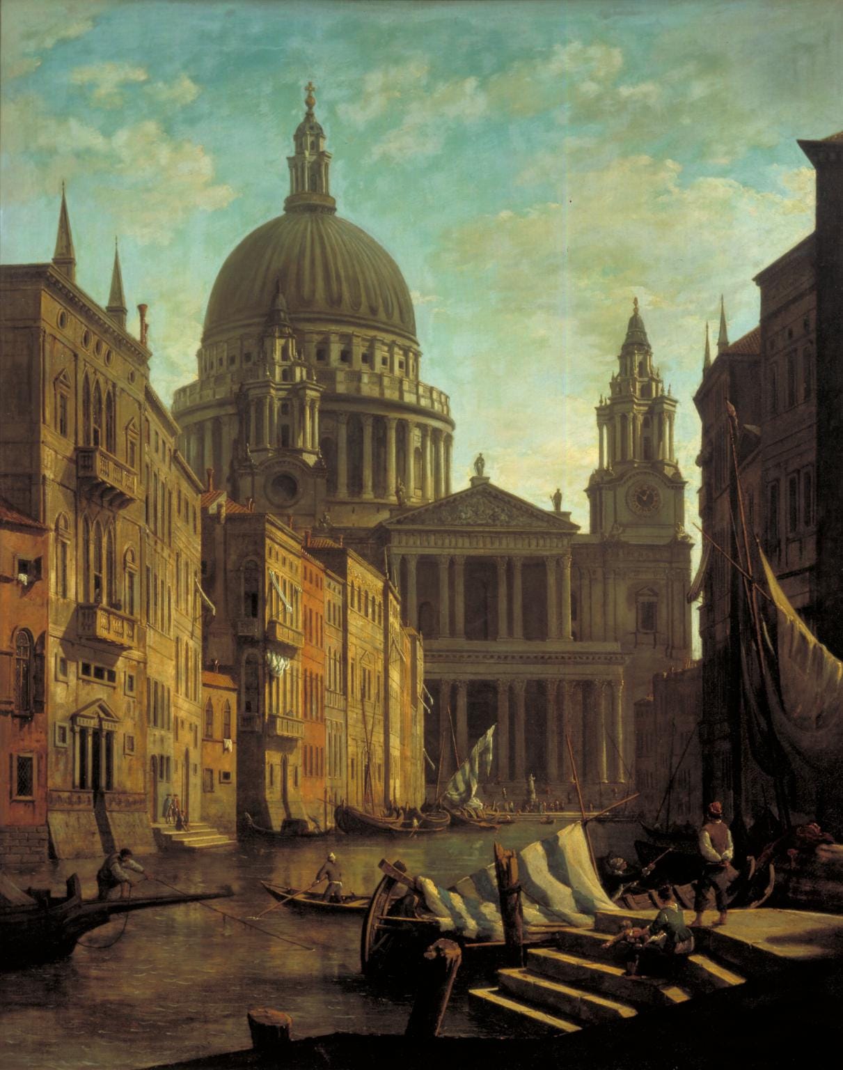
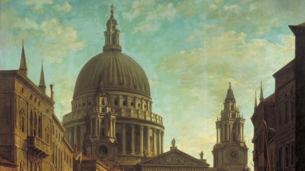
It's called Capriccio: St Paul's and a Venetian Canal, and it's by William Marlow. 1797ish. And - how can I put this? - it is really sodding big. It felt giant at that show, looming high off the wall. And it's properly weird too. In art 'capriccio' refers to an architectural fancy, the placing together of buildings that do not, in the real world, exist together. And sure enough, in the foreground of Marlow's work, painted in honeyed warmth, is Venice, buildings giving way to the water. And then in the background, rising up like a menace on a bad night out, is St Paul's. Our St Paul's - the Wren one in London that now looks a little dinky beneath 20 Fenchurch or whatever that skyscraper is that is curved in such a way as to regularly set nearby sidewalks on fire.
Here is where I tell you what the painting is all about. But sadly, I can't. WIlliam Marlow is relatively obscure. We know his dates and the stuff he liked to paint, and the fact that he was influenced by Canaletto (who isn't, right?), but there isn't much more to say about him. He's one of those other painters, the ones who never get a big show in their name. There are a couple of his pictures knocking around the place, but they're generally just sort of fine. In truth, Capriccio is just sort of fine. Numerous people I've shown it to over the years have pointed out things that aren't that great about it. Look at those clouds - they feel like a missed opportunity? (Marlow could never win on this one - he had the misfortune to work at the same time as two of the best painters of clouds who ever lived.) And elsewhere I gather the eye can be a bit too distracted by the lighter elements flapping around the centre of the imagery - you're left to ramble about in the gold stuff not quite sure if you're missing something important. Maybe another painter could have done more with the line formed by the top of the Venetian buildings on the left, while on the right an attempt to add depth to the space doesn't quite come off?
What it means to me, though, well: I find it properly transporting. I love this painting. I find within its simple juxtaposition of two disparate city elements a sort of doomy narrative, a narrative of a glitchy world gone wrong, where time and space overlap a little in dangerous ways. St Paul's - this does not come across in reproductions - looms with an ominous grey that seems to challenge the gold of Venice. The size of thing does not come across in reproductions either, but it gives the piece a wonderfully monstrous aspect. I've always wanted M John Harrison or PKD or somebody like that to write a novel about Capriccio: space out of joint, as it were. O, cursed spite!
I know this painting pretty well now, because many years back an old girlfriend got me a copy of it. This was not easy to do. Marlow's Capriccio is in the Tate stores, but it turns out that you can pay the Tate to nip into the stores and photograph the painting you want. I had looked for a postcard of it or something like that back at the exhibition, but I hadn't been able to find out. Now, weird as it sounds, I suspect I might be one of the only people in the world to have Capriccio by William Marlow on my wall.
I say my wall. Foolishly when my mother moved to Brighton a few years back I gave her Capriccio in exchange for a lovely Manet of a house with a tree in front of it - showing the Japanese influence, she always told me - that she also decided to keep for herself anyway. So if I want to see my Marlow, I have to go over to hers. (Granted, if I do, I can see that Manet at the same time.)
Last time I went over there, I had something new to show her though, a genuine bit of a breakthrough, or at least a bit more in the shadowy story of this not-great painting that nobody but me cares about anyway. Look at this.
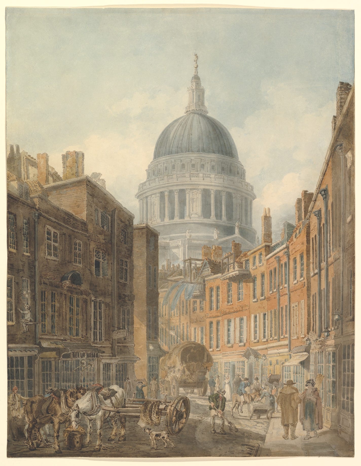
Familiar? I think it is anyway. It's called St Paul's Cathedral from St Martin's-le-Grand, and it's owned by the New York Met. It's painted by another contemporary of Turner's, Thomas Girtin. Girtin was a bigger deal than Marlow. He and Turner were friends and rivals, and Turner, who did not praise others easily, acknowledged Girtin's mastery with watercolours in particular. To quote Turner precisely: "Had Tom Girtin lived I would have starved." That counts as a compliment from Turner, who was, frankly, a bit of a jerk. But Tom Girtin didn't live. He died in his late 20s, in 1802. What he did before he died, though, amongst other things, was knock this out in roughly the same era that Marlow was creating Capriccio. So who came first? What does it all mean? Purely a coincidence?
I don't know about the Girtin painting, which feels as much like a sketch as the finished thing anyway. I stumbled on it a year ago and I'm still getting used to it. But as for Marlow, well. I like to think that one evening, on the great grand tour that painters were meant to do back then, not-very-good-but-not-bad painter Marlow was punting about Venice with his sketchbook when the world briefly broke down. He turned a corner and looked up, and there, briefly, was St Paul's Cathedral, glitching in from London and filling the sky with morbid gloom. And only he saw it.