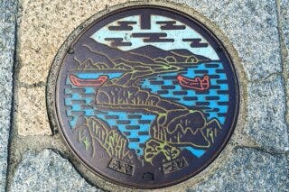
A lesson in beautiful information, from manhole covers
Put a lid on it.

I've been pretty interested in manhole covers for the last week or so. I read about them in the brilliant The 99% Invisible City and since then, well, I've gone down the manhole, as it were.
The 99% Invisible City talks about the Manhoru movement - a Japanese trend for decorative manhole designs displaying "location-specific motifs" and everything from Hello Kitty to elements of folklore. Back in the eighties, the original impetus for this stuff was to raise awareness of subsurface utilities at a time when only half of Japanese households were connected to municipal sewers. Since then it has become a thing of joy and creativity in its own right.
My sister was once very excited about a manhole cover in Canterbury that had a spelling mistake on it. But there is so much more to be intrigued by. Outside of Japan, I was fascinated to discover that the cross-hatching patterns a lot of manhole covers have is to aid traction. Yet that is just the start.
Here's what really got me: according to 99% Invisible, in Seattle, some manhole covers have city maps on them. In Nashua, New Hampshire, the triangular covers "point in the direction of subsurface flows". This has really stuck with me for some reason, and I think I know what it is.
There is something deeply pleasing about an object that is surprisingly information-rich. Something about an object or an image that does one thing, and then a couple of other things too, out of generosity or sheer elegance. It's not just manhole covers, of course. If you've traveled to and from the EU as a non-EU citizen - British people will now be able to see this for themselves - it's lovely to see how much information the standardised EU passport stamp contains. The country is in the top-left corner. An image shows the means of transportation in the top-right and an arrow in the bottom-left explains whether you're entering or leaving. It's beautiful in its spareness, and it contains a lot of details about the journey.

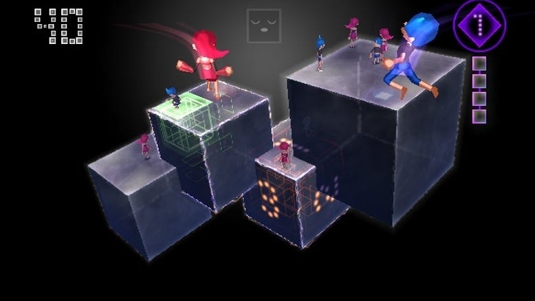
Inevitably this reminds me of a game. Kenji Eno's WiiWare charmer You, Me and the Cubes. I remember sitting with Rhod Broadbent of Dakko Dakko once while he explained how much he loved the stage select screen of this game, where each completed level filled in a square on a grid. More importantly, and also less importantly, as is always the way with things that capture additional information, the manner that the square was filled - the size of the filling and how much it moved - captured details about the level of total completion achieved.
That menu system didn't just deliver more information than you might have expected, it also, like the Manhoru and the passport stamps, made the information beautiful. Creativity and ingenuity and a certain elegance - something deeper you can discover if you look for it. And that's what I've learned from reading about manholes, really - utility can be thoroughly appealing on an artistic level. Louis Sullivan was right. Form really does follow function.