Why do so many modern games have tiny text?
Behind one of gaming's least helpful trends.
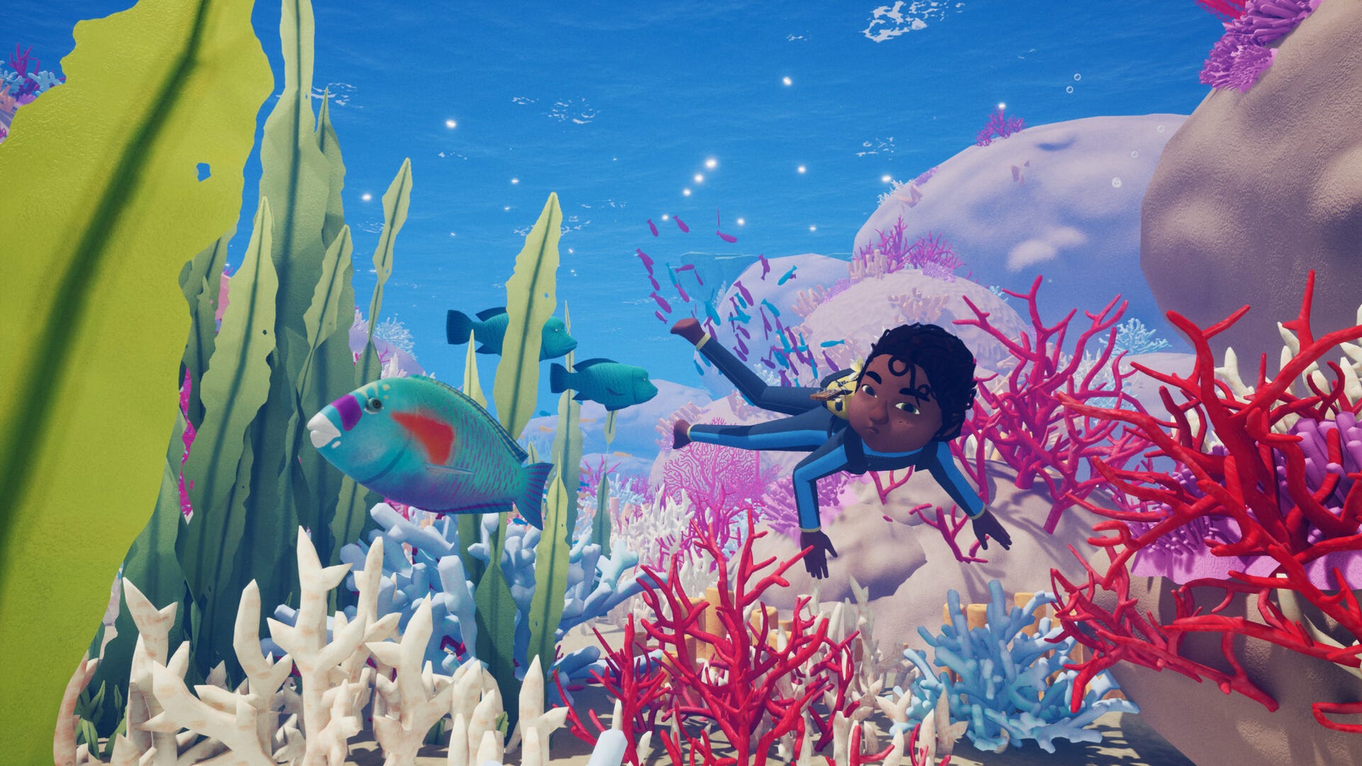

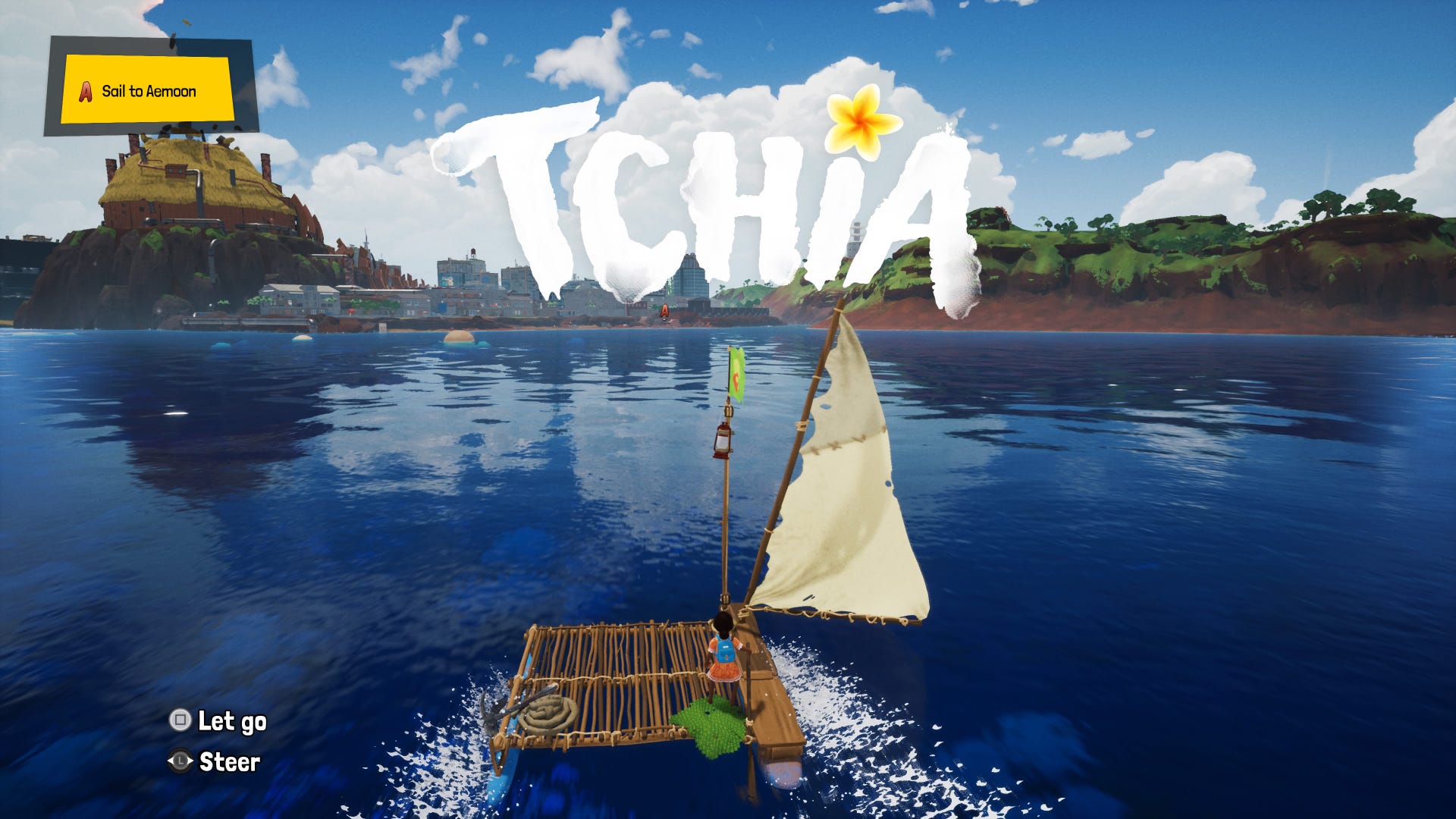
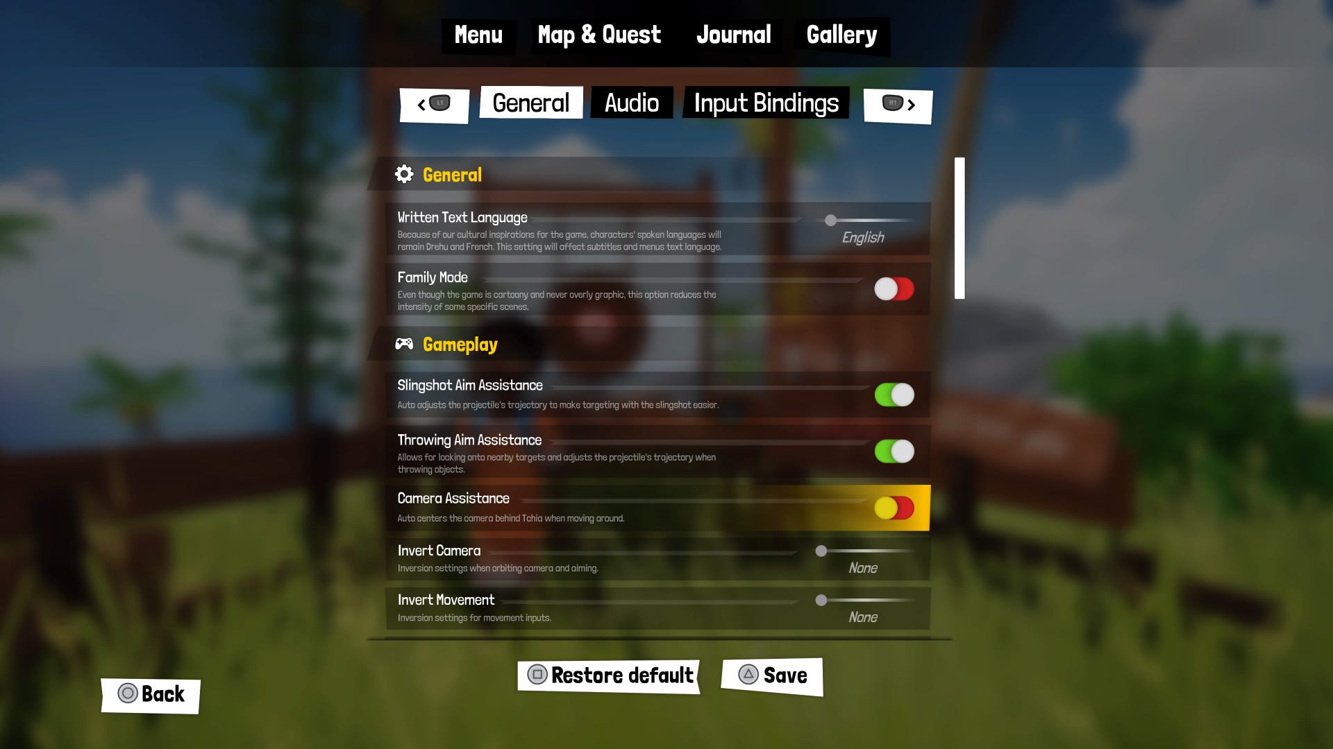
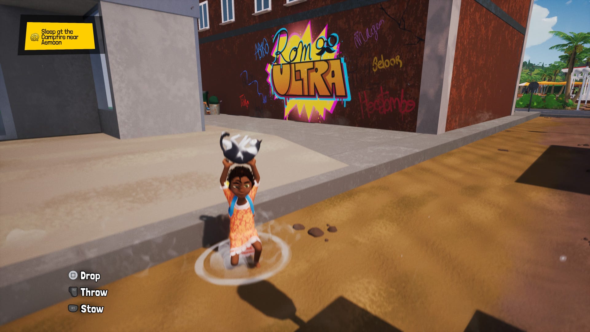
Starting Tchia is an experience. The music starts, you realise the entire game is voiced in French and Drehu, and you know it's a game built on passion. If you're like me, however, starting Tchia also involves encountering the unreadable text in its options menus.
It's unfair to single Tchia out. It offers a wealth of accessibility options. But it also represents the most recent example of a growing trend in video game UI, in which text is becoming smaller and less legible.
To understand why this is happening, and explore possible solutions, I spoke to accessibility consultant Ian Hamilton and lead designer of typeface studio Lettermatic, Riley Cran.
"Miniscule text is by far the most common accessibility complaint," Hamilton tells me via email.
A lack of understanding of typography and its application isn't exclusive to the video game industry. The erosion of basic design principles is leading to typographic failings throughout the design industry and beyond. But it's especially glaring in games. Despite gaming's focus on the visual, text is still a primary way in which games communicate. Yet, too often that information is lost to illegible type.
Hamilton suggests our displays are partly to blame. "In days gone by," he says, "it just wasn't technically possible to design tiny text as resolutions weren't high enough; there just weren't enough pixels."
As screen resolutions improve, smaller type is able to render in sharper focus, something which developers appear keen to take advantage of. However, this ignores minimum readable text sizes.
For instance, Hamilton says, "For someone with full 20/20 vision on a typical screen in a typical living room viewing environment, text needs to be in the region of at least 28px at 1080p."
But reading isn't an objective experience. 28px may be readable for sighted players, but visually impaired gamers may need text to be much larger. For this reason, Cran tells me via email, "typography should be adjustable, simply to cater to as many of those experiences as it can."
You may think this makes the answer as simple as making text bigger - and, to a point, it does. But changing text size, weight, tracking, or leading has major ramifications for UI. Interface elements designed around small text can't necessarily be scaled up for larger or bolder text without affecting the balance of the UI.
During its collaboration with Double Fine on Psychonauts 2, Lettermatic's solution was multiplexed fonts. These are typefaces that do not size proportionally like traditional typefaces, but rather take up the same space whether they're bold or regular. Coupled with the ability to switch fancy type for something more readable - something Tchia also offers - Psychonauts 2's text became remarkably accessible.
"One of the things I love about the collaboration between Lettermatic and Double Fine," Cran says, "is that we're looking at typography in games as a flexible experience that can change based on the players preferences, rather than an immutable aspect of the experience that never changes."
Unfortunately, collaboration between those with grounding in accessible typography and developers appears rare, with smaller text rapidly becoming the norm in a development process in need of reform. According to Hamilton, "the way that game UI is usually designed and built today is not fit for purpose."
While basic tenets of typography are being ignored, the simple truth is that, Hamilton says, "the environment in which games are made bears little resemblance to the environment in which games are played."
Developers create UI on large, high-definition monitors right in front of them. This is a context in which few of us play.
"You have some players who are playing on a Nintendo Switch or Steam Deck," Cran says. "PC players are probably a couple feet away from a monitor that is 4x larger than a handheld device, and then you've got console players who may be 10-15 feet away from a 70 inch television in their living room."
But how often are these circumstances adequately tested? Even on Switch, little is done to make sure text remains readable when the console moves to handheld. Nor are we seeing evidence that games are tested in standard environments.
"Some studios do have a 'living room' setup, but I've been in a lot of studios over the past couple of decades and in all that time I've only ever seen one that was actually like a living room. Typically it's whatever small spare space could be negotiated for, but with a big fancy TV in it because company money is paying."
This means games fail to respond to the situations in which they're played. Testing of text size happens not during development, but at launch - by players.
It goes against everything I learned as a designer, namely that you must consider the context in which designs are used, not in which you're developing them. Yes, this mistake is being made across many industries. I've seen designers working in print, for instance, who never actually print out their work. But that others don't consider the end user isn't an excuse - no matter how many times we hear developers use it.
But how do we make things better? Game developers could learn a lesson from web developers. In the early-2010s, as mobile web browsing became more commonplace, they had to contend with how to make sites legible on small screens. The solution: responsive design.
"Visit some of your favourite sites on a PC, and try changing the size of the window," Hamilton says. "For most sites [oddly, Eurogamer isn't one of them, but Hamilton provided this demonstration] as you drag the window bigger and smaller you'll see the layout change on the fly to work appropriately within the space that's available."
It means that games could respond to the screens and resolutions on which they're played, not developed - catering to a more subjective experience, rather than a perceived objective readability.
However, it remains important to incorporate considerations of accessible and responsive type into the process as early as possible, Cran says, "rather than reworking things at the end to provide these kinds of features, which can feel like the bottom piece on the Jenga tower of visual design."
But it's not just developers that need to consider text size. Outlets can help not just inform players about whether games will be accessible to them, but also inspire change in the games they feature.
Even if a reviewer isn't comfortable calling games out on accessibility issues like small text, "you can still let people make informed purchase decisions by ensuring that UI text is shown in the screenshots of your reviews," Hamilton says. "The same could easily be done for other key accessibility issues too, like showing what subtitles look like at their most prominent settings, or showing what the default controls are."
It behoves us all to work towards a more accessible future: the community, journalists, outlets, everyone. For developers, doesn't it make sense to make sure the information you spend countless hours organising and presenting can actually be read?
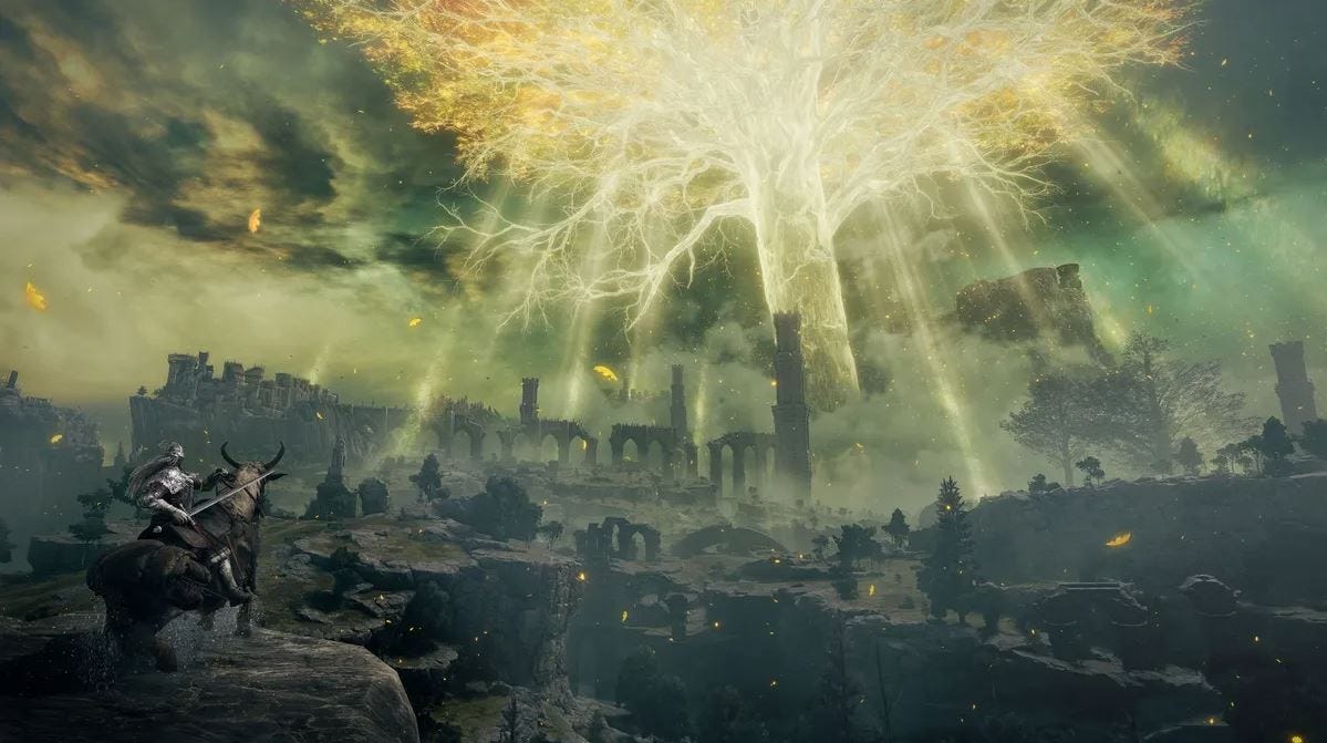
It's challenging, there's no doubt about that. But the text sizes we're seeing now simply aren't good enough. It's a failure of design, one few are willing to admit to, especially when found in their favourite games (cough, Elden Ring, cough). But as Tchia demonstrates, even some of the best games - games which have the best intentions around accessibility - can be markedly affected by not ensuring players are able to read the information they provide.
Glossary
Font/Typeface: A typeface is a set of characters and a font is how those characters are implemented. For instance, Times New Roman is a typeface, while Times New Roman 12pt is a font, as is Times New Roman bold. However, these terms are often used interchangeably and only the worst pedants will correct you.
Weight: Type weight are categories of fonts, like bold, italic, semibold, etc.
Tracking: The generalised space between letters. This is separate but linked to kerning, which is the space between individual characters.
Leading: The space between lines.
Proportional type: Type that resizes proportionally to its weight, taking up more space the bolder it gets.
Multiplexed type: Type that inhabits the same total space regardless of its weight.