U died: what's going on with Demon's Souls font on PS5?
Typo.

There's a new generation of consoles just around the corner, and one of them's even got a launch game. It's a pretty damn compelling one too - Bluepoint Games' collaboration with Sony's Japan Studio to remake the iconic and much-loved Demon's Souls is one of the most exciting propositions on the PlayStation 5 slate, and to have it there on day one gives the console one hell of a push. But... There's something slightly awry about all this.
Like many of you, I'm sure, I first picked up Demon's Souls having read about it on these very pages thanks to Keza Macdonald's incredible review. What a thing the PS3 original was - enigmatic, unforgiving and totally unputdownable. And so began a love affair with From Software's series that's continued to this day.
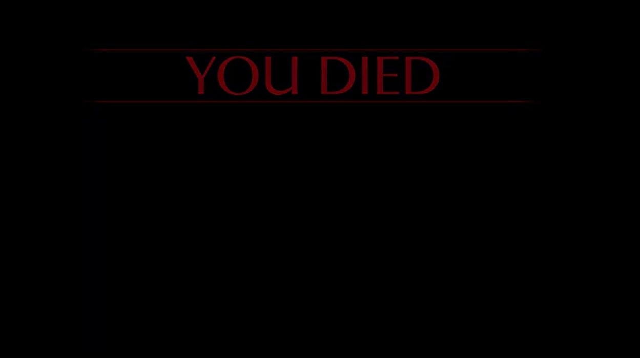
This isn't From Software's Demon's Souls, though. From its first reveal it's been obvious that, while the fundamentals are the same, this is a radical makeover. There's a broader, less repressive palette, everything's that little bit shinier and - oh my god what's this - they've changed the 'You Died' typeface. WHAT?
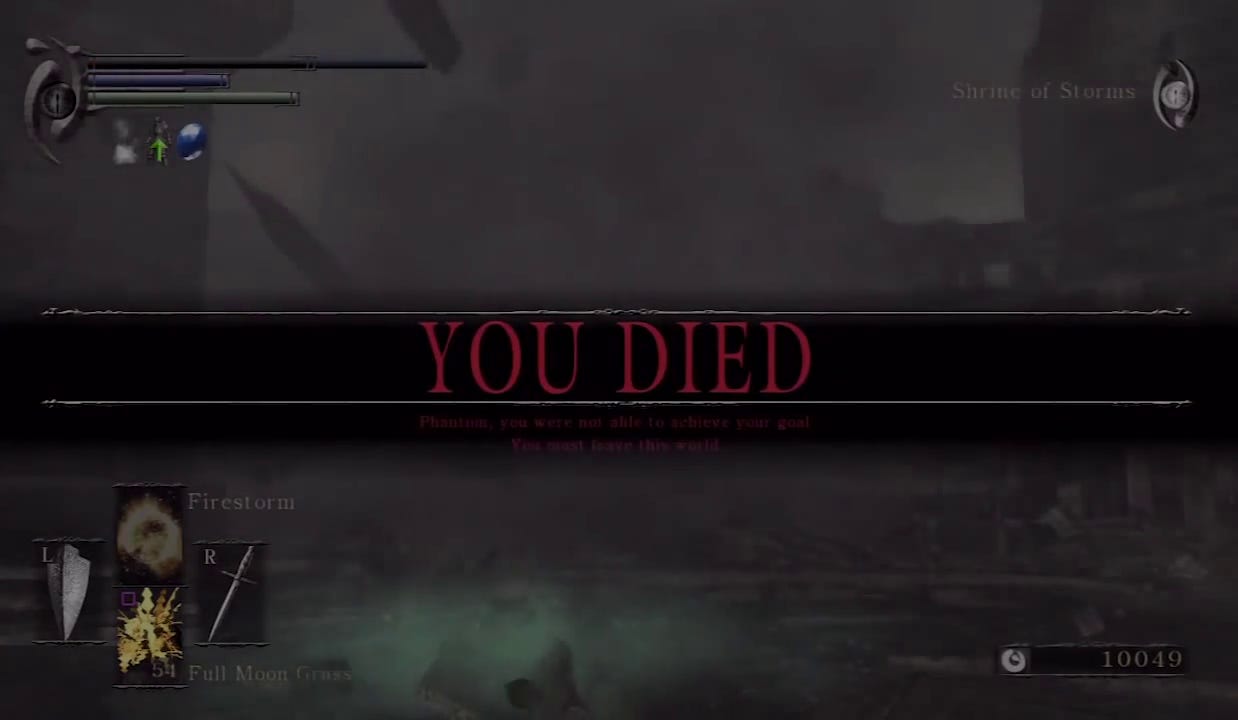
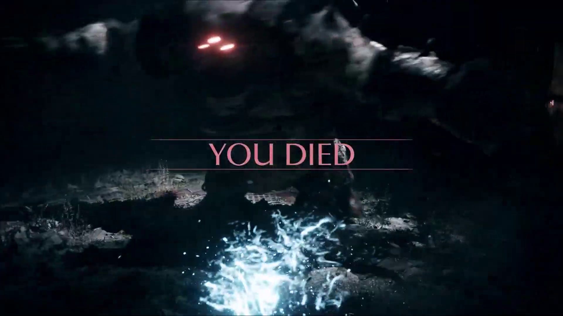
That splash screen is perhaps the most iconic part of From Software's 2009 game, and certainly what defined its legacy - it was a constant reminder of your fallibility, spurring you on to try and try again. And while the typeface had yet to evolve to its final form - I believe Dark Souls uses something like Optimius Princeps for its own splash screen, a slightly more elegant take on it all - it still had a spidery, gothic grace. There's not much of that in the remake's take on the screen, which has been whittled away until it's something else - it looks more fitting for a business card for a company that repairs fridges. And what is going on with that U? It's almost offensively modern.
Things change, and yes it can be dumb to get hung up on that kind of detail (though fonts are serious stuff, especially within Sony - I've heard off-hand that Polyphony Digital's kerning is some of the best in the business, the coding behind which remains a closely guarded secret). It raises an interesting point, too. Bluepoint Games has evolved over the years, going from masters of the remaster - working on the God of War Collection and the Metal Gear Solid HD Collection amongst other things - to more of its own entity, with its own identity. The Shadow of the Colossus remake, as brilliant as it was, ended up far from Fumito Ueda's original 2005 vision, even if the core remained.

This Demon's Souls, too, looks like it's forging its own path. Is it sacrilege to tinker with such things? Bluepoint Games is in a curious business with its remakes - they're not preservation, nor are they exactly restoration but they do stop just shy of reinvention. It's going to be fascinating to see what else has changed beyond that font, and what tinkering has gone on under the hood (what if they have done the unthinkable and added an Easy Mode to a Soulsborne game?!!), but one thing's for certain. This new Demon's Souls is going to be different.