Street Fighter 6's logo looks like an Adobe stock image, and its creator wants a cut
The gloves are off.

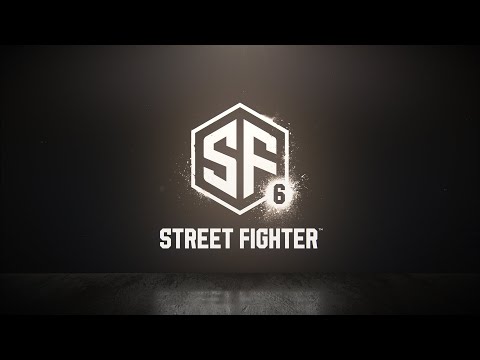
The new logo for Street Fighter 6 has caused quite a stir online, with many likening it to a stock image found on Adobe (thanks, Aurich). Now, the creator of said stock image has offered to sell the exclusive rights of their design to Capcom.
Adobe image creator xcoolee spoke to IGN about their logo being 'used' by Capcom and shared they "were looking to sell exclusive rights for the image to Capcom, removing it from sale to other parties".
Here's that stock logo:
There is, of course, a chance that Capcom's new logo baring a striking similarity to xcoolee's Adobe Stock image is just a coincidence. But even if that does turn out to be the case, the new logo for Street Fighter 6 hasn't exactly won itself scores of fans.
Many have lamented the fact that Capcom has chosen to shun the once vibrant and martial arts inspired Street Fighter logos of the past for something that is... well... boring.
The new logo is just generic, and if you look hard enough you will see it pretty much everywhere.
It is also incredibly similar to the logo for a sci-fi convention held in France.
And yes, it does look alarmingly like that of NFTs logo.
Others have pointed out that this new logo makes it look like Street Fighter has six new messages waiting to be read.
Along with this logo being underwhelming at best, many have pointed out that this is the first time that a Street Fighter logo hasn't used roman numerals. Rather, we have been presented with an Arabic numeral '6'. Hmmm.
This maybe wasn't the reaction Capcom was hoping for when it announced Street Fighter 6 to the world, but there is no denying it has certainly got people talking!