It's time for game makers to start seeing the world in two colours
Dichromancy.
Hello! Welcome to our ongoing series looking at accessibility in games. Today Edward Hawkes takes a look at games and colour blindness.
Some time in the distant past, our ancestors moved to the treetops and decided that fruit was quite delicious. Before that, we weren't fussy. Afterwards, fruit was top of the menu. And so we evolved three-colour vision to distinguish unripe fruit from the very ripest. Or, that's one theory. In truth, we don't know for sure what caused our colour vision to change in the deep past. But for whatever reason, although most mammals see the world in two colours, most humans see the world in three. It's called trichromacy.
Now, I know what you're thinking. There are more than three colours. Richard of York gained battle in vain for this. Well, hold your horses, because poor Richard did not gain battle in vain in vain. There are many, many colours, but, for most humans, these are all mixes of red, green, and blue. Trichromats have three colour receptors, called 'cones', at the back of their eyes, and all the colours of the rainbow are constructed from these three basic building blocks. Different ratios of red, green, and blue can create most any colour. And those of you with three-colour vision can try it out for yourself using the colour twiddler in Microsoft Paint.
However, while most people have three fully functioning colour cones, not all of us do. Some of us have anomalies with one or other cone that make certain colours harder to see. That's called 'anomalous trichromacy'. And some of us have two cones only, called 'dichromacy'. These conditions are more colloquially called 'colour-blindness'.
Before you trichromats start feeling smug about your extra cone, it's worth remembering that many animals have more than three. Most birds are tetrachromats - four colour cones - and their lives are a perpetual ultraviolet disco. By comparison, all humans are technically colour-blind. But some of us are more colour-blind than others.
Human colour-blindness comes in a few different flavours. The most common is red-green colour-blindness. In fact, this is two different conditions: 'green-blindness' (deuteranopia), and 'red-blindness' (protanopia). But both have similar outcomes: It becomes difficult or impossible to distinguish reds, greens and browns. And hard, also, to tell apart blues, purples, and dark pinks. There are other types of colour-blindness too. There's blue-blindness, which is just as it sounds. And some people see the world in monochrome. But these are rarer.
However, while certain types of colour-blindness might be rare, colour-blindness itself really isn't. Almost eight (eight!) percent of people with a Y chromosome have some form of colour-blindness. If you know more than thirteen men, one of them is probably colour-blind. It's less common in people with two X chromosomes, but still around one in two hundred. Approximately thirty million people in Europe alone are colour-blind. That's five times the population of Ireland.
Given that it's so common, you'd expect colour-blind gamers might be well catered for. And, to be fair, many games have colour-blind options. But too many games still get it wrong. Sometimes game-breakingly wrong.
The problem is that colours not only make things pretty, they're also intuitive and immediate. So game designers often rely on colour to communicate gameplay-critical information. It's useful. But, when designers chose the wrong colours, games become hopelessly unintuitive for colour-blind players.
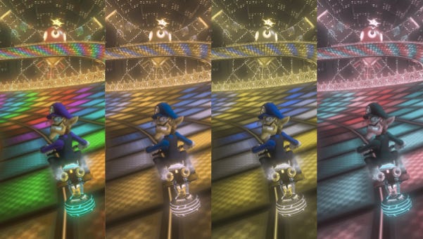
This happens often. Mario Kart's red and green shells are iconic. The red shell is a homing missile, the green fires straight. But, of course, if you're red-green colour-blind, they look identical. Resident Evil's red, green, and blue herbs can be mixed in potent combinations, which is quite difficult when you can't distinguish them.
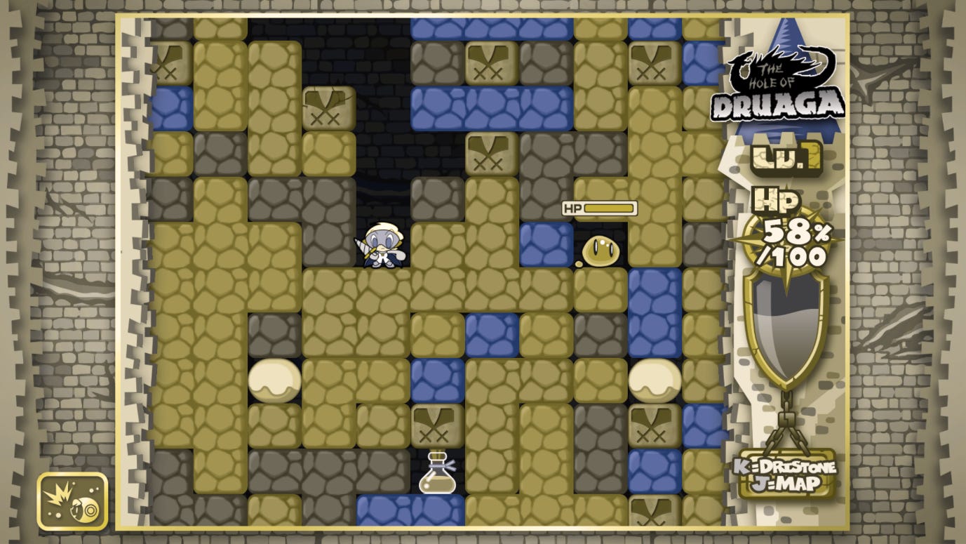
The wrong colour combinations make certain games straight-up unplayable. It's a huge problem for puzzlers. If you've got red-green colour-blindness and you want to play a few rounds of classic Puyo Puyo, bad news! The green and the yellow Puyos look the same. Want to avoid being squashed in the Mr Driller Drill Land remaster? The indistinguishable green and yellow blocks are here to ruin your day.
The problem is not just old games or small dev teams either. Hearthstone is the sixth most watched game of all time on Twitch and has recently released a new Pokémon-like RPG mode, Mercenaries, which has a rock-paper-scissors typing system. Casters beat protectors, protectors beat fighters and fighters beat casters. But these are coded red, green, and blue. And since there are no colour-blind options, colour-blind players must either squint to see the tiny UI cue, memorise each individual character's class, or just play a different game.
And colour-coding issues are just the tip of the iceberg. Certain colour palettes can make foreground characters blend into the background. Try playing Fifa when the kits are the same colour as the pitch. Other games, especially real time strategies, often use so many colours on screen that the action becomes one huge, uninterpretable mess.
Now, to be fair, colour-blindness is hard to understand if you have three-colour vision. Learning about the topic means navigating a dense jungle of terms like 'protanomaly' and 'retinal cone cells'. We can't expect game designers to memorise mantras like 'deuteranopes cannot distinguish blues and purples'. But here's the thing. They don't have to. There's a plethora of free tools that do the hard work for you. This tool lets you pick a nice RGB colour palette and will tell you if it's colour-blind friendly. If you want to go one step further, there's free software that, at the click of a button, shows anything on your screen as a colour-blind person sees it. Game development suites like Unity and Unreal even have colour-blind simulation addons that let you see your games in real time as a colour-blind person does. And, if all that fails, you can usually just ask a colour-blind person to help.
Although we have a way to go, progress is being made. The Outer Worlds has no colour-blind mode because the game was designed from the outset to be colour-blind friendly. More and more games each year have one-click colour-blind presets. Some games, like Audiosurf, even let players chose individual UI colours so players with rarer types of colour-blindness can find their own solutions. Other titles display gameplay information with patterns, textures, and symbols. Bejewelled is a great example. Although it uses a rainbow of colours, since each jewel is also a different shape, it's completely playable in monochrome. Into the Breach and FTL are also great at this. And the extra readability doesn't just help colour-blind players, it makes the game more intuitive for everyone.

However, while we're moving in the right direction, there are still hurdles. Puyo-puyo Tetris 2, for example, eventually got a colour-blind update. But this came two months after launch when many had stopped playing, and the remaining players were battle-hardened veterans. Overwatch introduced excellent colour customisation options in 2018, with full control over UI colour indicators. But players had to endure two whole years without them. Comprehensive colour-blind options should be there from the start.
Why? Well partly it's just politeness. It's annoying when you miss out on the fun because someone in the UI team didn't think ahead. If birds ever start making tetrachromatic puzzle games, we'd all feel the same. But more than that, it's just good business. I'm sure there are several reasons that Hearthstone Mercenaries isn't exactly flourishing. But designing a game that's inaccessible to ~8 percent of the male playerbase really cannot have helped. Hopefully fixes will come. But they might come too late.
So, if any devs are reading this, next time you embark on a new project, pump the brakes for a moment and think hard about your colour palette. Because it's easy to design for colour-blind players, especially if you start early in development, and there's a plethora of resources at your fingertips.
It's time to start seeing the world in two colours.