Microsoft unveils new logo for the first time in 25 years
Spot the difference.
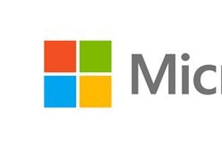

Microsoft. It's one of those logos that you probably just ignore. It's everywhere. It probably flashed up three times before your computer was fully booted.
But, ahead of this year's Windows 8 release, that's all about to change. Out with the old (that's the bottom one) and in with the new (the other guy).
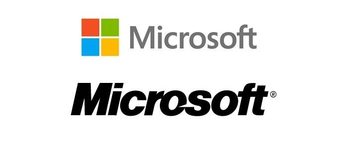
For the first time, the coloured Windows symbol has been plonked next to Microsoft's name.
The now neatly square tiles are an obvious nod to Microsoft's "Metro" operating system, the right angle-loving aesthetic seen across Windows 8 PCs and Surface tablets, Windows Phones and Xbox 360.
The fact this is now present in Microsoft's logo surely points to a company that is more unified, as platform types and services continue to bleed in together.
Or they've just upgraded to a colour printer and wanted to show it off.