EG techs explain new gamepages

Access things with greater ease! Ahem.

Hi folks! Often when we alter the site in some fundamental fashion, you, our beloved readers and users, have queries about what we were trying to achieve, such as "What the bloody hell have you done you stupid morons?" and "Do you even understand how to walk? How do you not fall over and axe-murder yourself with your legs whenever you exhale?" So it's high time we started blogging about the things we do, starting with our next site update, the new gamepages, which go live today.

'EG techs explain new gamepages' Screenshot 1

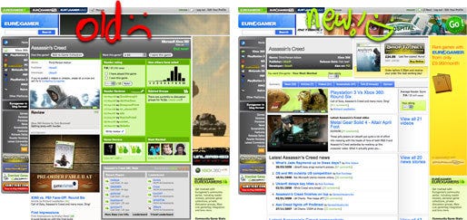
The old gamepages had grown out of date. There wasn't enough content at the top of the screen, so you were having to scroll down past a huge community data block and advert to get to a list of content before you saw more than a single article entry. Even when you finally got to the content, it appeared as overwhelming lists, which often set fire to nearby pets and small children. Gamepages also suffered either from having too much information or not enough. When there was very little content, the page was almost useless, but when there was too much, the page would stretch off into the distance uselessly.

Our solution involves breaking content down into more easily digestible blocks, and highlighting the freshest or most important content. We then keep archives of all the other content available in tabbed category pages. The benefit with this kind of solution is obvious: the most relevant content is smack-bang in front of you, but you can also dig deeper if you choose. The editorial team also has a degree of control over what appears on this summary page, allowing them to create a far more comprehensive home for that game within Eurogamer.

We've also integrated the actual community tools (game collections and ratings) into a community toolbar, and moved the rest of the data to an "Opinion" tab. The thinking behind this was that while often interesting, community statistics are unlikely to be something that people searching for information on a particular game want to see right away. Coupled these changes with other niceties like proper news and article archive tabs, and a full EGTV video archive that can be previewed in-page, and overall we feel it's a suitable evolution for what's previously been an overlooked and underused area of the site. Hopefully once you've had a bit of a play and explore, you'll agree. Let us know what you think in the comments.

Comments (16) Latest comment 3 years ago

Comments threads automatically close after 30 days, but please feel free to continue chatting on the forum!

  • Syrok #1 3 years ago

    Looks better, but needs a system-requirements-section for PC games. :)
  • Mr-Brett #2 3 years ago

    It's good but I think it needs an artist's touch, it looks a little raw at the moment.
  • Lexx87 #3 3 years ago

    System requirements is a good idea, and also you can't "read more" on that blog entry :)
  • mouse Verified Graphic designer, Eurogamer Network #4 3 years ago

    Syrok: It does have space for the system requirements, but it requires the editorial team to update them :)

    Lexx: Yep, bug alert! :)

    Mr-Brett: Interesting thing to say. We did take a more spartan approach with this area than in others because there's so much content that it really doesn't help to interfere - we tried to give as much space as possible to let the content breathe. Having said that, I'm well aware that it's definitely not that pretty, and at some point I think it might be worth having to look to see where it could be tarted up. I just feel the layout has precedent at this stage.
    Edited by 1 at 05/09/08 @ 20:18
  • zoidberg #5 3 years ago

  • seasidebaz #6 3 years ago

    WOOHOO!

    I will look at it later, when sober.
  • DFawkes #7 3 years ago

    I much preferred the old way, and I always will. Everything I personally wanted was right there (especially reader reviews), no need to click on tabs just to see stuff I like. Plus I really, realy despise putting videos as one of the priority things - I never watch them and the old style didn't paint htme hot pink and throw them in your face.

    But this is all just personal choice, it's still nice enough and it works fine, so good work whoever implemented it :)
  • ChthonicEcho #8 3 years ago

    Looks a lot better, if you ask me. But, as I've noted before, Screenshots are still outside of this delicious layout, unfortunately.
  • Cappy #9 3 years ago

    Sorry guys but that is just damned awful.

    So it looks worse, that's fine I'll take that hit if there is some increased functionality unfortunately even there it's coming up short. Where is the dinky little bar graph that shows how people voted on a title? A picture is worth a thousand words and all that. I don't see any information on user ratings anymore on older games. Try looking at Beyond Good And Evil. The layout is dreadful for older games full stop.

    *edit* I see a lot of that stuff is hidden away on the opinion tab now.

    Even simple things like how many users own a title are totally gone and some of the new tabs don't even work, Talk for instance, you can't access any of the listed threads even if you are a member of the associated group.
    Edited by 1 at 06/09/08 @ 14:27
  • Toothball #10 3 years ago

    I think it's pretty good. The Screenshots tab loses the tab bar though, which seems like a bit of an omission?
  • yazooo #11 3 years ago

    Great improvement, I like the tabs, and the way all the info is collated and easy to get to on a gamepage now. Only thing is the access to said gamepage, say from an article. I clicked on a Far Cry 2 article on the main page, and had to scroll down the bottom to get to a link to main the gamepage, a link near the top, somewhere on the right maybe, or the titile or something I thought would be handy.

    Oh and yeah, when looking at screenshots, tab bar aint there, it needs to come back for better navigation! Oh and the articles listings, some dates of when they were posted pehaps?

    Oh and perhaps on the summary page, to make it uniform for all gamepages, you could have one of each, of latest news, article, video and screenshot?
  • CitizenGeek #12 3 years ago

    I preferred it the old way ;)
  • Tweakmonkey #13 3 years ago

    The developer links from the game pages don't work. Apart from that I like it.
  • warlockuk #14 3 years ago

    ...no FHUTA button?
  • moggsy #15 3 years ago

    I think you need to give more prominence to the review - like the old style layout did. I just went to the Call Of Duty 4 Xbox 360 page and had to hunt for the actual review.

    Also the Xbox Live section is given quite a lot of prominence now but it doesn't give you any useful info. For example how interesting is it that 'thinkdontpray' has got 37/37 Achievements - not very.
  • Ryze #16 3 years ago

    I seem to have lost the ability to check how many and which fellow EGers own a particular game.

    Am I going about this in the wrong way anyone? Is the link buried somewhere?

    Or has this been removed intentionally? I found it useful in inviting people I recognised to join certain groups or to play games online.