Me, myself and UI
Meet the game designer doodling the interfaces of the future.

What does the future feel like? Forget what it looks like: how do you grasp it? What does it feel like in the palm of your hand, in the tips of your fingers. Think about switches, dials, and keyboards made of nothing but light. Forget the horizons, think about the UI of tomorrow.
I have come close to this future, I think. I encounter it most mornings when I'm scrolling Instagram and I come across Michael Murdock. You know Instagram: mine's mostly the artful crumbs, foams and airs of modern food, along with sweet natured, gormless doggoes and the occasional brutal intrusion by Mrs_Angemi, a pathologist from New Jersey who likes to take pictures of the awful, beautiful, vivid things she encounters at work in order to educate her followers.
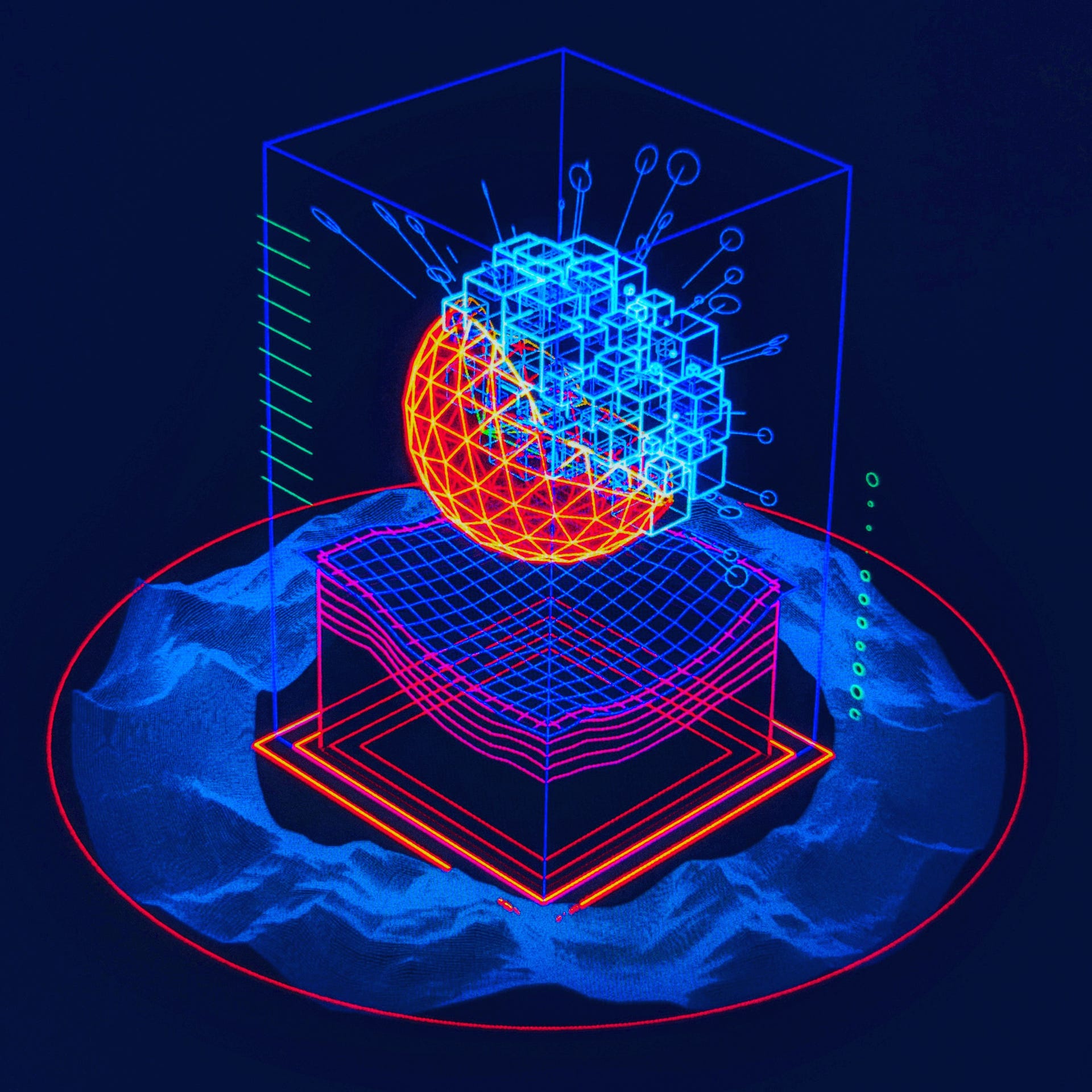
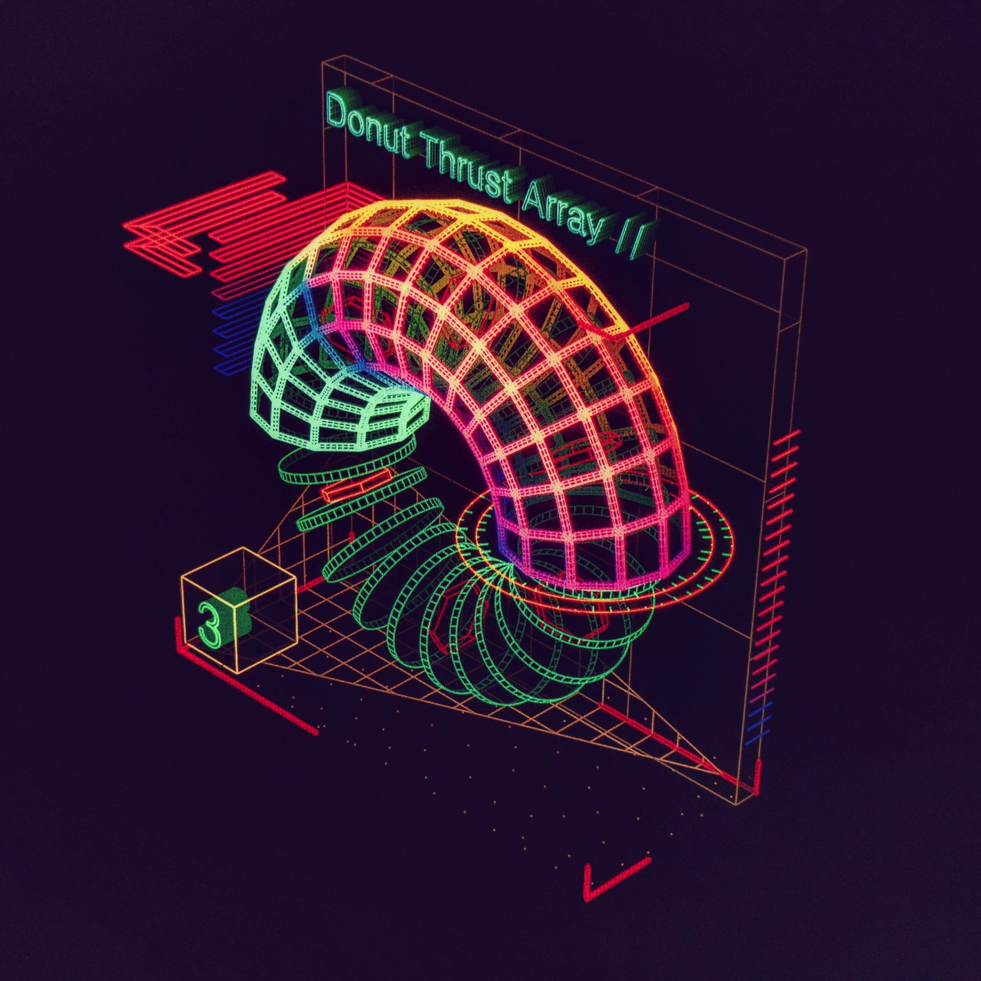
Michael Murdock's a bit different: His Circular Logic Board offers a lime-coloured cube that appears to have the consistency of jelly, making the pins set within it shimmy back and forth on the stiff tides. His Primary Cortex Buffer is something you might hold in your hand. Maybe you would grasp the glowing trackball at the bottom and see the gradients shift on the landscape pane above it as you scanned alien worlds. I'm not sure what you'd do with his Quantum Resonance Module, a globe that radiates sharp little arrows, but I do know you wouldn't want to sit on it. Most days it is like this, anyway. No cakes or cute animals from this guy: instead Murdock gifts me a magical thing that looks useful while also suggesting that it might be, like, completely radioactive.
Murdock is a trim, rather courtly man who defines himself as an artist, designer and director. His day job revolves around VR games - "Big, arena-scale stuff, theme park stuff, multiplayer stuff," he tells me. "It's crazy!" - but the things that end up on his Instagram account are a side-project. Think of it as futuristic interface design, he tells me. But it swiftly becomes clear that it's more complex than that. Think of it as retro-futuristic interface design: the nuts and bolts, levers and doodads of a shimmering neon world that will now never come to be.
The interfaces started before the VR games, back when Murdock was working in Palo Alto for a startup and commuting in each day from the Bay area where he lives. I ask if that means this stuff is the equivalent of doodling. "Yeah," he says, and then admits it was a certain kind of frustrated doodling at first.
"Essentially. I started doing them when I was a contractor at the startup doing real interface designs," he says. "During the day, the only actual thing in the app we shipped that I actually designed was a new badge. It was a little thing that popped up and says "NEW!" I designed, like, fifty of them, and then they picked the one that was..." he trails off for a second, and then laughs. "Well it was gold and it said "NEW!" and it was like a starburst thing, so let's go with that one! That was the day, man. Designing really clean minimal things, expending a lot of effort but not feeling like I'm making any real progress."
So after a full morning and afternoon of that, Murdock would sit on the train with his laptop and make imaginary interfaces. He was using a 3D package called Houdini that he was trying to learn, but it was also just a kind of release. Mild as Murdock is, it actually sounds a little like revenge on an unsatisfying job. "It was great," he says, describing his own brief for the interfaces. "It was like, don't make it usable, don't make the user journey work so that people can 100 percent get it and understand the interface and use it. It's just like: play with shapes and colours and that's enough."
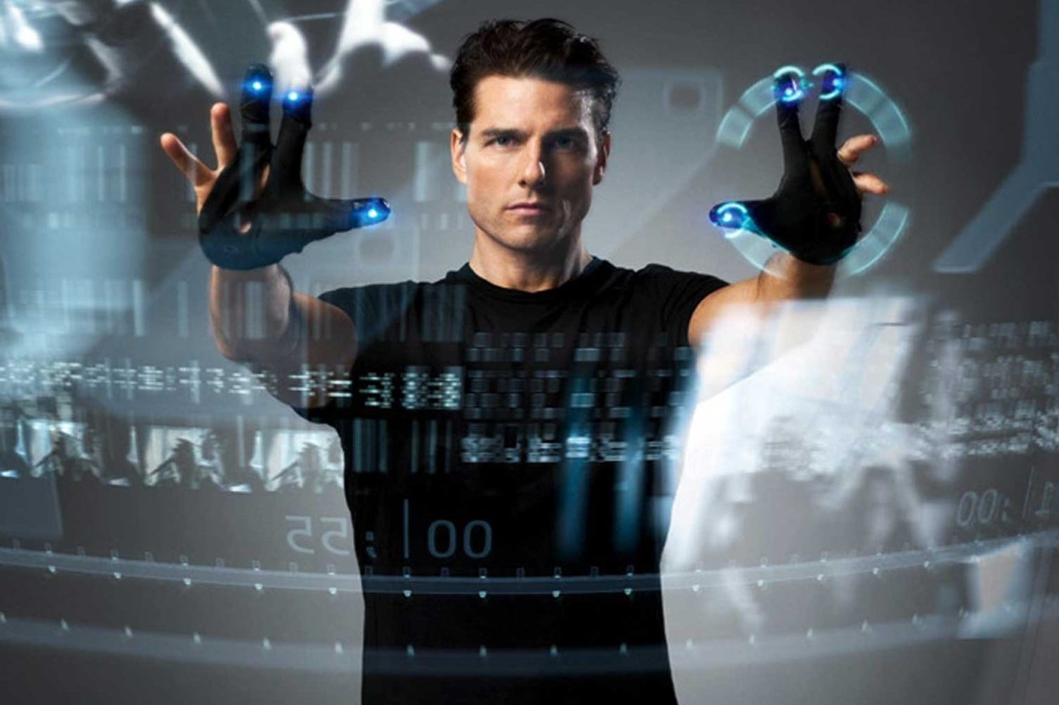
I tell Murdock that I look at his interfaces and can't help myself from doing a sort of Minority Report claw-hand instinctively. They're made of nothing but a few disco scribbles, these things, but they are intensely, innately three dimensional, and so tactile you just want to grab them and twist them and rotate them. The appeal to me is the whole user-journey bit, in fact. They suggest a world of specialised training. I can almost imagine the desktop thud of the manual you would have to work through before you were cleared to use them.
"My process for starting each one is that I found this sci-fi technobabble generator online," Murdock replies. "It just kicks out a phrase like, 'We need to balance the non-manifold zero-point wave generators.' All those phrases you hear from Star Trek. So I go and I hit refresh a few times until something sparks my interest. That sounds like a cool interface: let me build something like that!"
Speaking of Star Trek and Minority Report, Murdock is inspired by sci-fi interfaces from movies and TV - but only movies and TV of a specific time period. "I love the Alien and Aliens interfaces," he says. "My stuff sits squarely in the aesthetic of the seventies to the nineties. What I like about that is that filmmakers were showing interfaces in movies but they didn't really know what computers were or how you used them yet. If you look at movies now like Iron Man, it's just like, well, advanced technology's just a hovering iPad. You swipe, you pinch. Minority Report was one of the last great movies in sci-fi interfaces where they had to invent everything. I love that phase back when it was, 'Oh, the script calls for somebody using a computer and I don't know what that does! So we'll invent it from scratch and it's probably hovering!'"
Perhaps this is what makes Murdock's work so fiercely appealing. One interface at a time, with each trackball, each floating array, each indescribable toggle, he makes me more and more dissatisfied with the drab technology of today. I don't know about you, but years back I didn't think 2018 would contain clicking on so many radial buttons. Wouldn't it be great if modern UI design was a little less utilitarian and a little more baroque - at least every now and then?
"Yeah. Companies like Microsoft and Apple and Amazon push everything very minimal," says Murdock. "The interface should vanish, it should be all about content. And yet there's a user-study done recently, and it was against Microsoft's Metro design. They flattened everything out with that design, they removed the drop shadow. And what they found is that users actually had a harder time doing basic navigation. Because before that the buttons that you needed for navigation had drop shadow, they looked like little jewels from early 2000 websites. Now everything's really flat and that's actually harder for people to use because you're removing all these visual cues.
"So yes, I absolutely wish we had more playfulness and more visual interest in our interfaces. Our interfaces aren't very kinaesthetic." He laughs, perhaps a little wistfully. "They don't feel very good to use."