Raiders of the lost art: Meet the illustrator behind your favourite childhood game covers
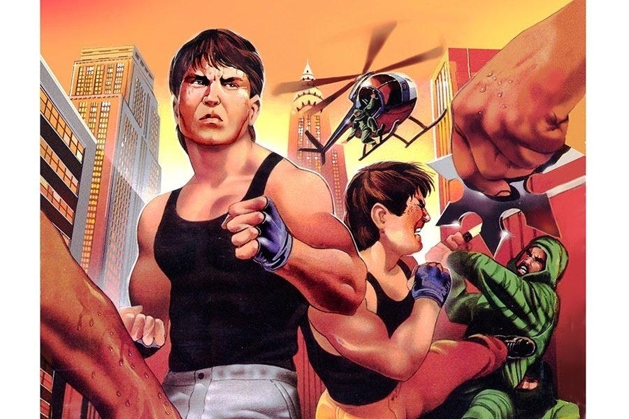
Marc Ericksen created the box art for Bad Dudes, Galaga, and infamously Mega Man 2.

To crib a phrase from Crocodile Dundee: This isn't a Galaga enemy.
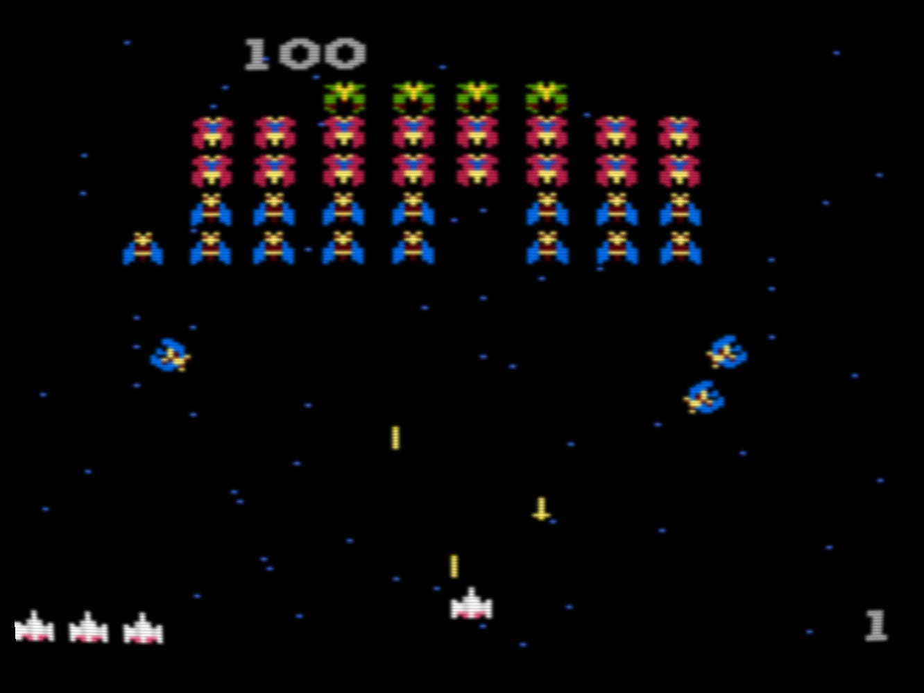
THIS is a Galaga enemy.
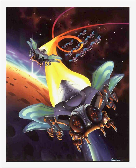
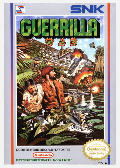
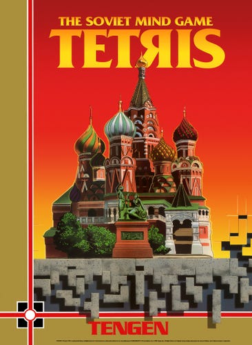
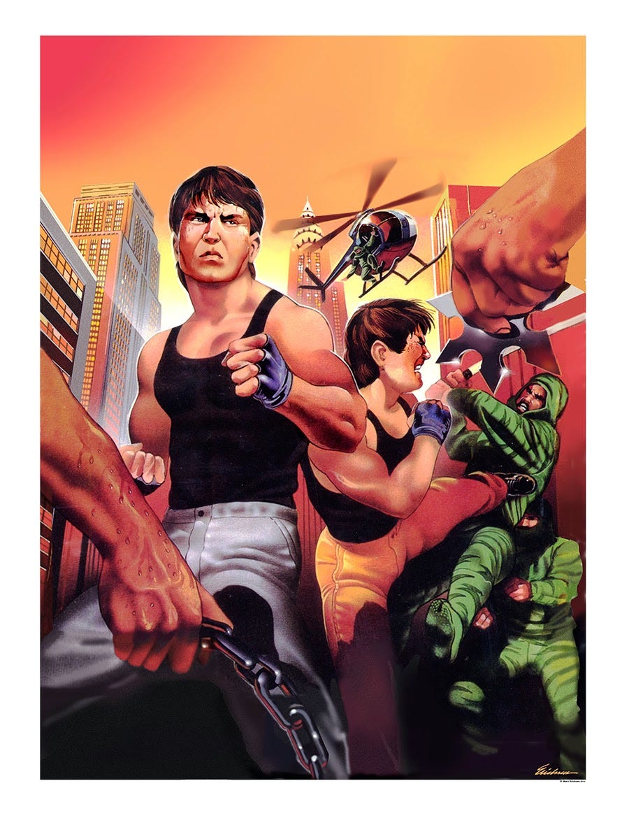
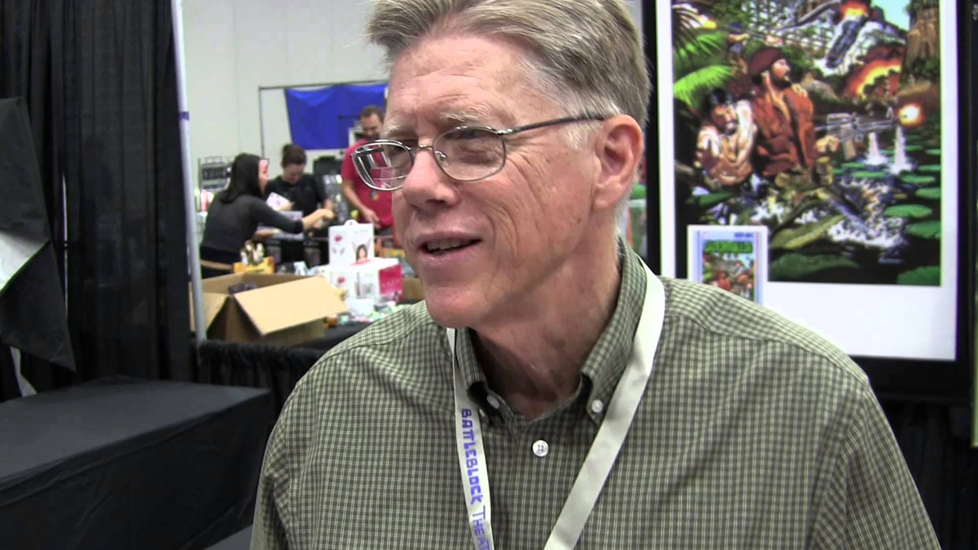
Sure, the former is the one you see in the game, but the latter is the one you see in your mind. Or at least it is if you've come across its dazzling box cover art. But chances are you had no idea where that art came from. Someone had to draw it. But who? Without a signature in the corner [added only to the reprint above], the artists who rendered these unforgettable images almost unanimously faded into obscurity. Until recently, that was the case for Marc Ericksen, the illustrator behind such classic covers as Bad Dudes, Tetris, Herzog Zwei, and most famously, Mega Man 2, where the iconic character is sporting a pistol and visor.
It's tempting to blame the illustrator on this colossal error, but in actuality Ericksen, now 67, was only following orders from Capcom.
You see, Ericksen was invited over to Capcom's US office in San Francisco so the publisher could show him an early version of the game. "Characters at that point in 8-bit configuration were really primitive. So I asked the art director at Capcom what he's doing and to tell me about the game," Ericksen recalls to me over a phone interview. "I said, 'this character, what's his weapon? What's he shooting with?' And so this gentleman studied him for a few moments and said to me, 'he's obviously shooting, so he must be shooting with a pistol. Because I don't see anything that looks like a rifle.'"
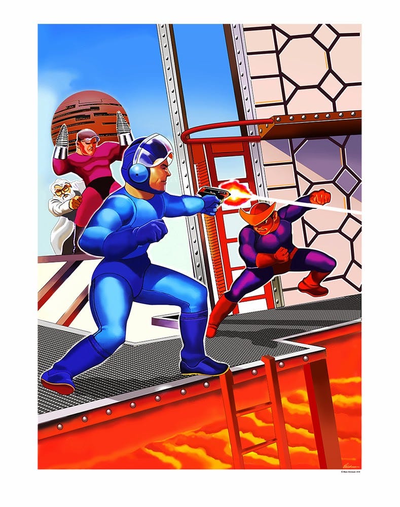
"As far as the visor is concerned, I was just trying to come up with a characterisation that looked somewhat like what we saw on screen," Ericksen says. "In Japan they were developing the Mega Man character, so there were examples of him showing up in a form that was very much like he became. But these folks, here in the US, were evidently unaware of what was going on in Japan because they basically told me to draw some iterations of what I thought would be a characterisation of Mega Man. So I had Mega Man in mind, not Mega Boy."
"I drew him the way I did because I was encouraged to do so by the people who were hiring me. And we went forward with that art, and when I delivered that art to Capcom they approved it," he adds. "Little did I know what a huge success it would become."
I ask if unique regional art may have been intentional since the graphics were vague enough that the same character could be interpreted differently by different cultures.
"It's really hard to say. I don't think anybody was really conferring with anybody," he replies. "Japan knew what they were doing, the US knew what they were doing and Europe knew what they were doing, but nobody was actually checking anything."
"The only thing you can conclude is that Capcom itself was not very well coordinated in their efforts to package and sell Mega Man 2. By the time Mega Man 3 came around the character had been ironed out and all the ensuring characters were this cute little Mega Man. This tough, little kinda young almost boy."
"I always thought it should have been called Mega Boy as opposed to Mega Man," he laughs.
Amazing, it took Ericksen over 20 years before he became aware of the infamous cover art-to-in-game discrepancy.
Ericksen, as it turns out, isn't a gamer himself. It's not that he dislikes the medium, but rather that he simply hasn't had time to play games as he's been a freelance illustrator for upwards of 40 years. Prior to that he served two tours in Vietnam, while during his several decades as an artist he raised two sons, both of whom play games to this day. But Ericksen himself is in it for the love of the static image. Currently a teacher at the Academy of Art University in San Francisco, where many of his students are gunning to get into video game animation, he's well aware of the leaps in graphical fidelity games have made over the last three decades. Seeing titles like Assassin's Creed and Titanfall flood the marketplace, Ericksen didn't think anyone still cared about the covers to old video game box art.
"It was about 2011 or 2012 that I even began to pay attention to all the video game stuff I had done," he recalls. "I was beginning to see the words 'retro game' appear online in various ways. So I started poking around and the very first thing I came to was 'The 50 Worst Pieces of Video Game Art Ever.' And Mega Man 2 came up high on that list."
"I was shocked!" he says, mortified. "I was embarrassed to see my piece of art [on that list]."
Yet at first glance Ericksen didn't see the problem. "I was fond of the art I did for Mega Man 2," he tells me. But it didn't take him long to see why many gamers weren't so pleased with this liberal interpretation of the character.
"Poor Mega Man 2 was being crucified online as the absolute worst," he remembers. "The whole thing was like 'how did Mega Man 2 get so screwed up? It must have been the illustrator!' At first I was shocked and saddened by what I'd read. Then I started thinking about the fact that I did Mega Man 2 and I guess people think it's pretty hideous so maybe all the [video game] art I did has been badly received."
It was this worrisome thought that provoked Ericksen, over two decades later, to dig through his back catalogue and see how his other covers held up in the cold light of the 21st century. It was in doing this that he made a couple of startling discoveries.
One was that he'd done far more video game covers than he thought. He'd wildly underestimated his contribution to the industry as about 20 covers,when in actuality it was more than 90.
And his other surprise was that they still looked good. Really good!
"Nobody was loudly denouncing the art that I had done," Ericksen tells me. "It was just that Mega Man 2 was so far off base on the characterisation. So I felt a little better about that."
With Ericksen rather proud of what he'd assumed had been a footnote in his illustrious career, the artist decided to go about reclaiming recognition for his most visible works.
"I went onto Moby Games and said 'My name's Marc Ericksen, I was an illustrator back in the 80s, I did some video game art. Do you think any of your readers would be interested in the background of the art?'" he recalls. "And the response from some of the key writers at Moby Games was that they thought people would be very interested if they could talk to the artist who did the box art. So that's what led me into beginning to show more of my work."
Of course, proving himself as the man behind the box art was a rather laborious process as most clients wouldn't let the illustrators sign the work. These images were going to be on boxes for all too see, after all. Only Broderbund let Ericksen leave his name tucked away in the corner, while the rest were delivered as clean copies for publishers to splatter logos and titles onto. In order for Ericksen to prove he was who he says, he had to send in old purchase orders, invoices, and most importantly professional photographs of his work taken on 8x10 transparencies.
You see, the whereabouts of most of the original paintings for these covers are unknown, though it's believed they've been binned.
"A lot of the art was destroyed by the companies through the course of events," Ericksen laments. "First off, they claimed all of the art because they'd pay us really well to do these. And their contention was they were buying the physical art, so we'd have to hand that over. And they'd take it and store it in these big rooms in their corporate office. As you can imagine, this art piled up over time. And when they'd downsize or join companies or do whatever, they'd lay staff off. Typically, nobody was really worried about the art at that point."
"They'd throw these things into the dumpsters," he adds. "My friend Robert, he worked for Atari, and he was literally pawing through the dumpster and found one of his pieces and rescued it.. And this happened at a time when I was out of town, so I only found out about it after the fact. So some of the pieces I did for the Atari and Lynx probably got thrown out then bulldozed at the landfill."
"I'd imagine if you were an art director at Atari, you probably took a few pieces home," he says with slight hope that some of his original covers are still gracing this earth. "But a lot of it was destroyed."
Luckily, Ericksen had a contingency plan. He had a photographer take high quality pics of his art before he'd submit it. They'd shoot it as an 8x10 transparency wherein one copy would go to the client, and Ericksen paid a little extra pocket money to keep a souvenir for himself. As such, he still has a series of really good quality 4x5, 5x7 and 8x10s of a lot of these pieces. That's what he uses to create the prints he sells today. It's a good thing he did this, as the boxes themselves have been significantly weathered over the years.
It came to Ericksen as a surprise that people wanted prints of his art in its original "clean" form without the title or logo splayed over it. "My question [to Moby Games] was 'if I provided a print of the art clean, just the way I did it back in the day before I handed it to the clients, would that be something they would be interested in?' he recalls. "And the voting seemed to go very heavily in favour of 'we would like to see the art clean, without the title or all the encumbrances that went on the covers.' So I asked, 'well how about me putting a line of type at the bottom discreetly that talks about the game and when it was produced and what sort of tools I used.' And even that they said 'no, no! We just want it blank.' That was a surprise to me."
These day Ericksen sells signed copies of his video game prints at the Portland Retro Gaming Expo, where I met him, at $40 a piece for an 18x24 and $25 for 13x19. As of writing this, his booth at the annual expo is the only place to purchase his box art reprints.
Why not go bigger, I ask? Clearly he has an audience. But maybe it's not quite as easy to get an audience as you'd think.
"You know how people are at a show. They walk by real fast on their first go through, because they don't want to spend anything yet. They want to see what's there then figure out how much they want to spend and what they want to buy. But even after that, when they walk by they don't want to have eye contact because they don't want you to hold them up. It's like, if you make eye contact with a vendor, he's going to grab you and want to talk to you about what they're selling," he says. "The first couple of shows it was brutal."
Eventually Ericksen got his pitch down. "They'd walk by and I'd say 'hey, how you doing?' And right away I'd get their attention for just a second. And I'd say, 'you know these games?' or 'did you ever play Mega Man 2?' And that would stop them for a second. And they'd say, well sure.' And I'd say 'well I'm the guy that did the art.'"
Still, people didn't quite get it.
"They would go, 'well, what do you mean?' And I'd go, "I'm the illustrator that did the box art.' And they would look at the prints and go, "oh, you did these?' And I'd say 'no. I'm the one that did the art that was on the box when you were eight years old.'"
"It takes that much effort just to get through the shell that they put around themselves as the show," he says. As such, he suggests something like Comic-Con is out of his league, nevermind its years-long waiting list.
"It's kind of hilarious, but it's very taxing to have to do that with every person that walks by," he says. "But once they get it, it's like 'Oh my god! You're the guy that did the art?!' Then they're all over you! But until then, you're just some guy who's pestering them."
Ericksen is used to it though. You may not think of an illustrator as being a career that requires a lot of social skills, but back in the day Ericksen frequently had to approach random pedestrians and ask them to model for him.
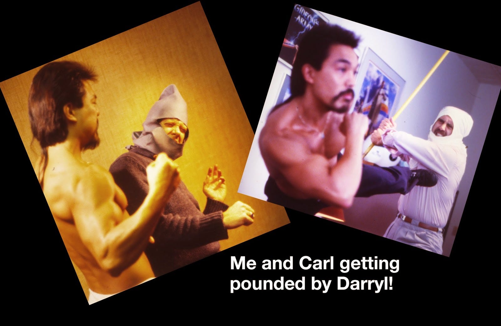
"If I had to have a soldier running across the field or I had to have somebody fighting, I would get two or three of my friends together and I would get my camera out on my tripod and we would take pictures of people fighting or wrestling or jumping. Those were the basis for the paintings that I would do the renderings on," he recalls. "Sometimes we'd go out and get models and bring them in. Sometimes we'd go out to the offices next door looking for particularly striking manly-looking guys; the sort of heroic figures I was looking for. I'd pay them $50 or $60 for a couple of hours of shooting."
"It was a hoot. Many of them were not models. They were just people I knew. I would literally at times stop people on the street and say, 'I'm sorry, you don't know me, but I'm an illustrator,' and I would carry a little postcard of my work on it to show them. I'd say 'I'd love to have the opportunity for you to pose for some of the action stuff I'm doing. Would you have any interest in that?' 90 per cent of them would say 'no thanks,' because it was pretty alarming. But the other 10 per cent were like 'hey, where is it?!'"
Despite occasionally spooking strangers, Ericksen has fond memories of these days, especially with the video game covers. "Doing the video game art was really a blast! It was very expressive and fun and kind of an exciting thing," he remembers. "The imagery was like doing comic books! Some of the environments were exciting. I had to come up with exciting action, and I got to draw guys in funny suits!" Since Ericksen typically drew more technical art, the video game jobs were where he got to stretch his creative muscles the most.
"Working with people who were excited about their games- sitting down and sketching with them the ideas that they were giving me that they wanted to have on the covers- it was all just totally fun!"
But these sorts of projects dried up in the 21st century and Ericksen recalls that his final video game cover was in 2003 for 1503 A.D.: The New World.
"What happened?" I ask. "Do you have any idea why you stopped doing video game covers?"
His answer is straight and to the point: "Once they reached a point where the animation was so fantastic, they didn't need illustrators. Back when it was 8-bit, they needed somebody to visualise it."
"So what do you make of more contemporary covers?" I ask.
"There's not much colour," he says disapprovingly. But he seems sympathetic as to why.
"I think that has a lot to do with the subject matter," he explains. "It's a grim kind of super reality that they want to put you into where you're fighting for your life. So there's all kinds of amazing imagery that you have - I think the Assassin's Creed stuff is particularly compelling in their covers - but it's almost always monochromatic, which is the way the gameplay is. They want you to feel as if you're in this gritty environment. So I think across the board many of these games just don't have the opportunity to have colour on the cover."
"But covers don't have to mirror the gameplay," I tell him. "They could still be anything."
"They could be anything, but I think they're on the right track to show the gameplay itself because then everybody has a real clear understanding of what's going on in the game," he replies. "And the gamers now don't have to be supported in their visual contemplation of what a game is... They've got entire staffs of hundred of highly talented people making these games and they certainly know what a compelling image is. So I just don't think there's still a place for illustrators in game packaging anymore."
Aside from gaming's monochromatic trend right now, Ericksen doesn't mind his previous role in the industry going the way of the dodo. In fact, he's downright supportive of cover art assets looking like their in-game counterparts because that disconnect is what brought him his greatest anxiety during his time as a video game cover illustrator.
"When I was doing these game covers, 20-30 years ago, in the back of my mind I was always worried that I was cheating the kids. Because here you put this big, exciting art then they put the game in and all that's happening is these little things are moving around on the screen. And I always thought 'this is really cheating the kids. The game doesn't look like this," he says. "So that first year at the show [PRGE], one of the first things I asked people was 'hey, listen you played these games when you were a kid. Did you ever feel gypped? That there was this exciting piece of art on the cover and then you got home and the game was sort of dull?'"
"Universally they'd all say 'oh my god no! This art is what gave us a construct in our minds of what we were doing in the game. If we hadn't had your art, we wouldn't have been able to imagine it! It made the game so much more fun!' That was a total surprise to me and one of the most delightful things that I found out in my time reconnecting with gamers - that they loved the art. That's huge to me."